The QCheckBox 小部件提供帶文本標簽的復選框。 更多...
| 頭: | #include <QCheckBox> |
| 繼承: | QAbstractButton |
| QCheckBox (QWidget * parent = 0) | |
| QCheckBox (const QString & text , QWidget * parent = 0) | |
| Qt::CheckState | checkState () const |
| bool | isTristate () const |
| void | setCheckState (Qt::CheckState state ) |
| void | setTristate (bool y = true) |
| virtual QSize | minimumSizeHint () const |
| virtual QSize | sizeHint () const |
| void | stateChanged (int state ) |
| void | initStyleOption (QStyleOptionButton * option ) const |
| virtual void | checkStateSet () |
| virtual bool | event (QEvent * e ) |
| virtual bool | hitButton (const QPoint & pos ) const |
| virtual void | mouseMoveEvent (QMouseEvent * e ) |
| virtual void | nextCheckState () |
| virtual void | paintEvent (QPaintEvent *) |
The QCheckBox 小部件提供帶文本標簽的復選框。
A QCheckBox is an option button that can be switched on (checked) or off (unchecked). Checkboxes are typically used to represent features in an application that can be enabled or disabled without affecting others, but different types of behavior can be implemented. For example, a QButtonGroup 可以用於邏輯分組復選按鈕,允許獨占復選框。不管怎樣, QButtonGroup 不提供任何視覺錶示。
以下圖像進一步闡明,獨占復選框和非獨占復選框之間的差異。
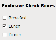
|
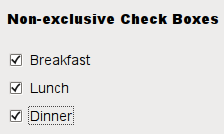
|
Whenever a checkbox is checked or cleared it emits the signal stateChanged ()。連接到此信號,若想要在復選框每次改變狀態時觸發動作。可以使用 isChecked () 查詢復選框是否被復選。
除通常的復選和取消復選狀態外, QCheckBox 還可選提供第 3 種 "無變化" 狀態指示。這很有用每當需要賦予用戶既不復選,也不取消復選的復選框選項時。若需要這種第 3 狀態,啓用它采用 setTristate (),和使用 checkState () 查詢當前觸發狀態。
就像 QPushButton ,復選框顯示文本,及可選小圖標。圖標的設置是采用 setIcon ()。文本的設置可以在構造函數中或采用 setText ()。通過在首選字符之前加 & 號可以指定快捷鍵。例如:
QCheckBox *checkbox = new QCheckBox("C&ase sensitive", this);
在此範例中快捷方式是 Alt+A 。見 QShortcut 文檔編製瞭解細節 (要顯示實際和號,使用 &&)。
重要繼承函數: text (), setText (), text (), pixmap (), setPixmap (), accel (), setAccel (), isToggleButton (), setDown (), isDown (), isOn (), checkState (), autoRepeat (), isExclusiveToggle(), group (), setAutoRepeat (), toggle (), pressed (), released (), clicked (), toggled (), checkState (),和 stateChanged ().

|
A checkbox shown in the Macintosh widget style . |

|
A checkbox shown in the Windows XP widget style . |

|
A checkbox shown in the Plastique widget style . |
另請參閱 QAbstractButton , QRadioButton ,和 GUI 設計手冊:復選框 .
This property holds whether the checkbox is a tri-state checkbox.
The default is false; i.e. the checkbox has only two states.
訪問函數:
| bool | isTristate () const |
| void | setTristate (bool y = true) |
構造復選框采用給定 parent ,但沒有文本。
parent 被傳遞給 QAbstractButton 構造函數。
構造復選框采用給定 parent and text .
parent 被傳遞給 QAbstractButton 構造函數。
Returns the check box's check state. If you do not need tristate support, you can also use QAbstractButton::isChecked () which returns a boolean.
另請參閱 setCheckState () 和 Qt::CheckState .
[virtual protected]
void
QCheckBox::
checkStateSet
()
重實現自 QAbstractButton::checkStateSet ().
[virtual protected]
bool
QCheckBox::
event
(
QEvent
*
e
)
重實現自 QObject::event ().
[virtual protected]
bool
QCheckBox::
hitButton
(const
QPoint
&
pos
) const
重實現自 QAbstractButton::hitButton ().
[protected]
void
QCheckBox::
initStyleOption
(
QStyleOptionButton
*
option
) const
初始化 option 采用值來自此 QCheckBox 。此方法很有用對於子類要求 QStyleOptionButton ,但不想自己填充所有信息。
另請參閱 QStyleOption::initFrom ().
[虛擬]
QSize
QCheckBox::
minimumSizeHint
() const
重實現自 QWidget::minimumSizeHint ().
該函數在 Qt 4.8 引入。
[virtual protected]
void
QCheckBox::
mouseMoveEvent
(
QMouseEvent
*
e
)
重實現自 QWidget::mouseMoveEvent ().
[virtual protected]
void
QCheckBox::
nextCheckState
()
重實現自 QAbstractButton::nextCheckState ().
[virtual protected]
void
QCheckBox::
paintEvent
(
QPaintEvent
*)
重實現自 QWidget::paintEvent ().
Sets the check box's check state to state 。若不需要三態支持,還可以使用 QAbstractButton::setChecked () which takes a boolean.
另請參閱 checkState () 和 Qt::CheckState .
[虛擬]
QSize
QCheckBox::
sizeHint
() const
重實現自 QWidget::sizeHint ().
[signal]
void
QCheckBox::
stateChanged
(
int
state
)
This signal is emitted whenever the check box's state changes, i.e. whenever the user checks or unchecks it.
state contains the check box's new Qt::CheckState .